Quick Accumulator
Quick Accumulator
Streamlining the betting experience to increase engagement and revenue

Overview
This project focuses on optimizing the user experience for Accumulators and Bet Builder bets. These are high-risk bets with high odds that drive user engagement and business profit due to high margins for one of the leading betting platforms in the UK.
As a UX Designer, I led the design process from research through to implementation, focusing on creating an intuitive, seamless, and dynamic experience that balanced user needs with business objectives.
The challenge
Our goal was clear: increase engagement and revenue by simplifying a complex and fragmented user experience.
The existing process was complicated, with multiple pathways and interruptions, particularly for novice bettors. A key pain point was the Bet Builder, which required multiple steps and a confusing flow that discouraged completion.
The complexity was not as much of a barrier for experienced bettors, but for newer users, the interface felt overwhelming. The disruptive pop-up and multi-step process made placing an Accumulator bet more complicated than it needed to be.
As a result, user engagement was stagnating, and the potential for business growth was not being fully realized.

Kiosk before redesign
Approach: understanding the user and the business
A crucial part of this journey involved collaboration with the Product Manager to ensure our exploration was comprehensive and aligned with both user needs and business goals.
I analyzed data from Google Analytics to assess user behaviour, specifically focusing on the conversion rate of users who visit the football page and place a Bet Builder bet.
I contacted the Customer Experience (CX) team to obtain post-betting surveys from Bet Builder users. The CX team gathers data from customer feedback, complaints, and issues, helping us identify areas for improvement and enhance the overall betting experience.
I held a workshop with a couple of colleagues to evaluate user pathways for the Bet Builder feature, identifying critical issues based on Jakob Nielsen's 10 Usability Heuristics.
In collaboration with a UX Researcher we have run unmoderated remote usability tests on Bet Builder to understand users' expectations and behaviours.
I used the HMW technique to identify ways to unify and simplify the betting experience process, increase turnover and improve customer satisfaction.

Example of the Sports Page

User persona
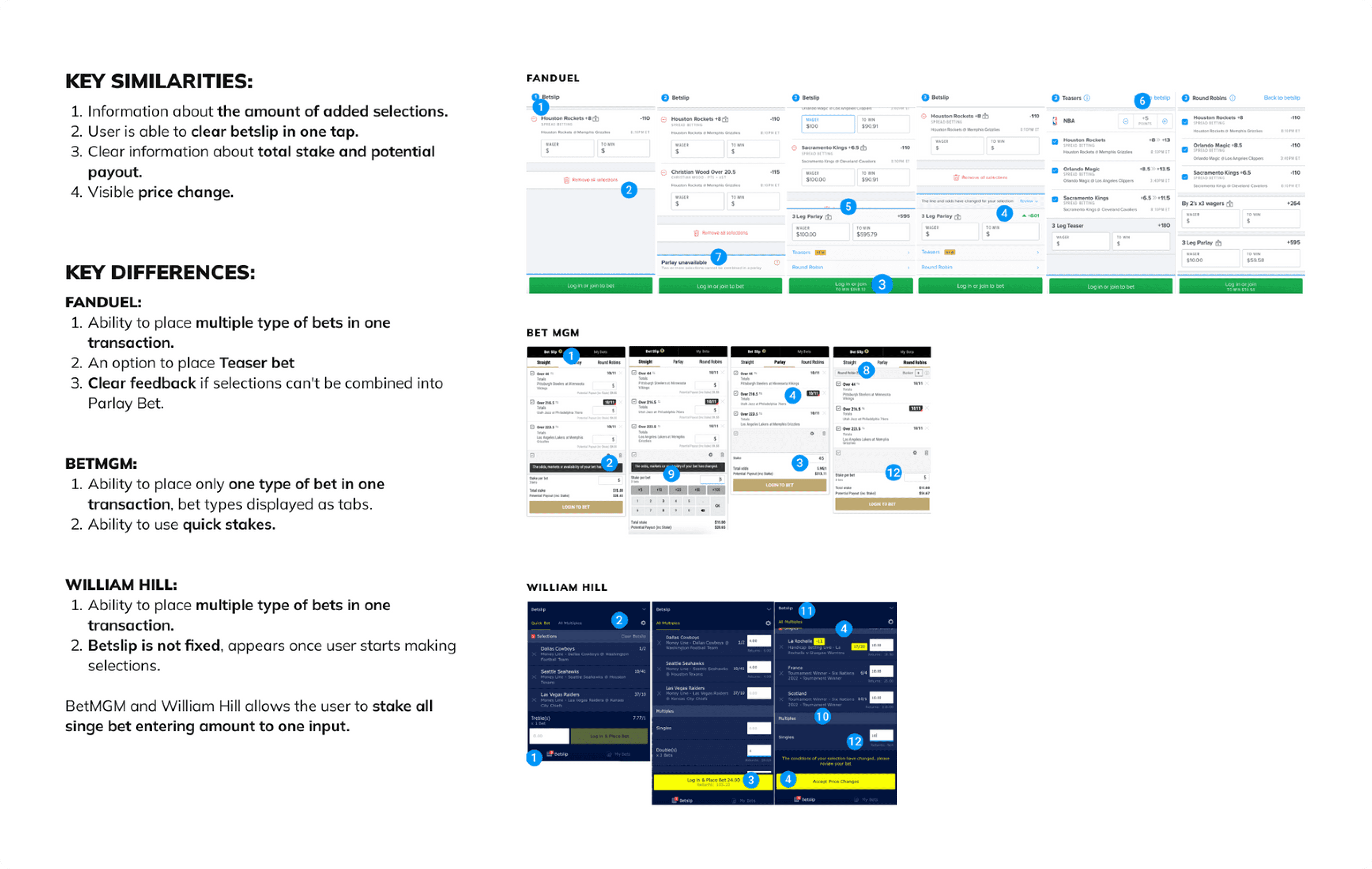
Example of competitor analysis for betslip
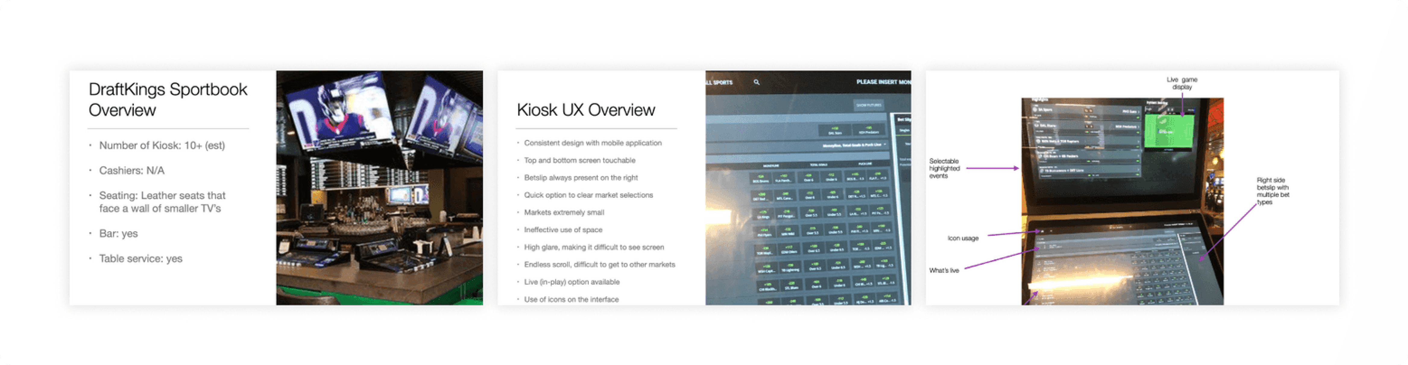
Example of field research

Research findings summary
Competitor analysis
I started by sketching and iterating on over 20 user journeys. These wireframes focused on reducing cognitive load and simplifying the process, ensuring users could follow a logical path without confusion.
In the wireframing phase, I intentionally designed the most comprehensive solution to establish a solid foundation and avoid drastic changes later on.
UX strategy
I organized a brainstorming workshop involving various departments such as branding and product managers to gather issues, ideas, and insights for improving our service balancing UX practices and business goals.
I organized a brainstorming workshop involving various departments such as branding and product managers to gather issues, ideas, and insights for improving our service balancing UX practices and business goals.
I organized a brainstorming workshop involving various departments such as branding and product managers to gather issues, ideas, and insights for improving our service balancing UX practices and business goals.
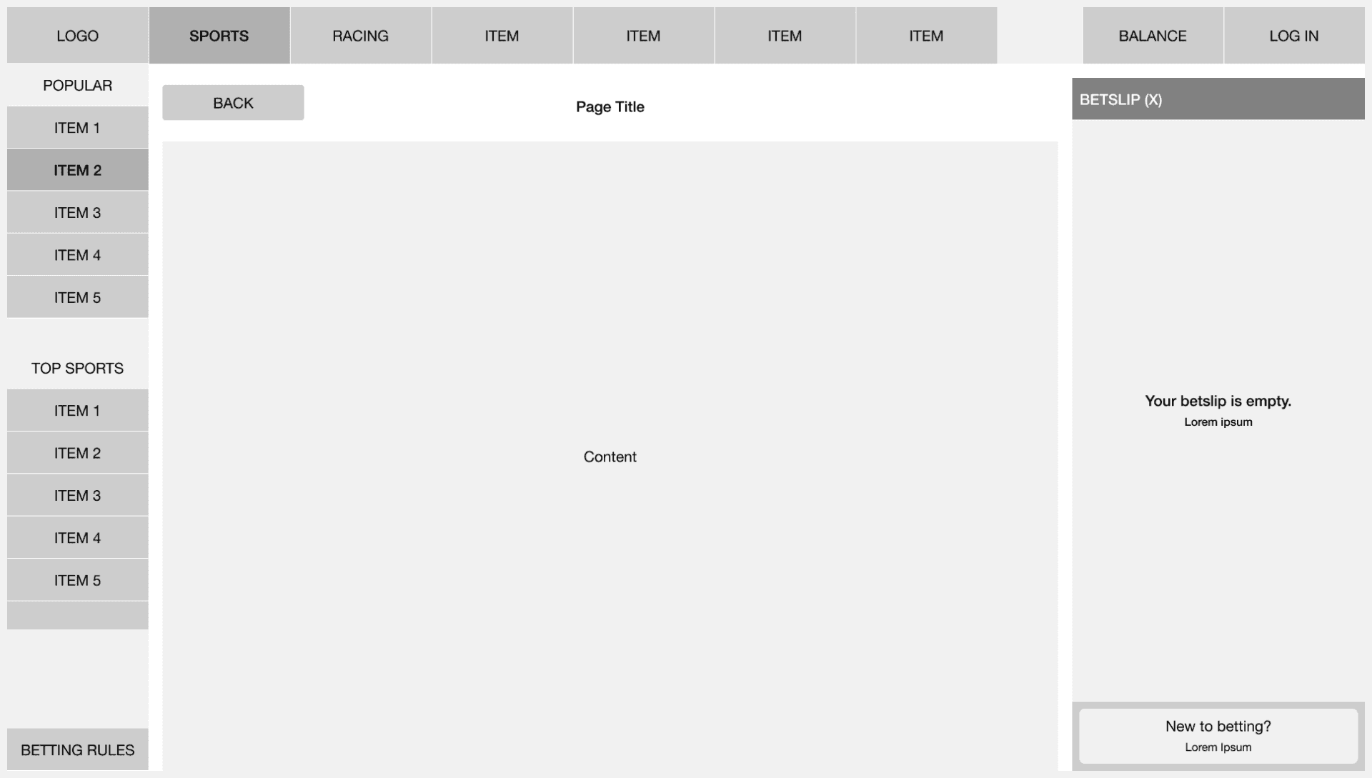
Example of wireframes for top navigation, side menu and betslip (no selections).
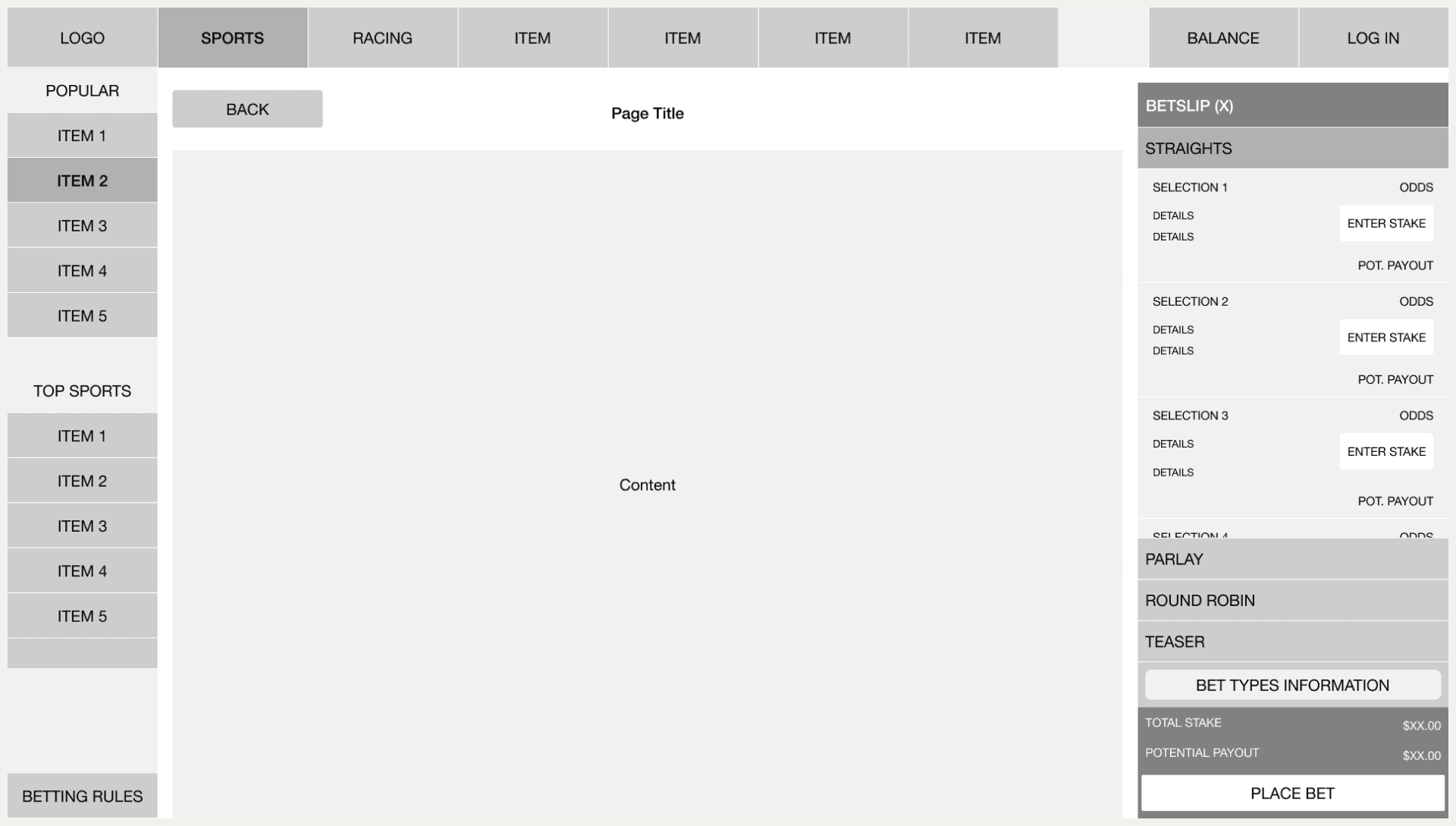
Example of wireframes for top navigation, side menu and betslip (with selections).
Designing a seamless, scalable experience
The solution needed to be simple, engaging, and scalable—designed to reduce friction, keep users invested, and boost bet placements while remaining adaptable for future updates.
Introducing the Quacca Bar
The Quacca Bar—a dynamic, user-friendly tool that let users browse and add selections while automatically generating Accumulator and Bet Builder bet types. By eliminating unnecessary steps, the Quacca Bar made the process faster, more intuitive, and more engaging.
Users could effortlessly build bets as they browsed, adjust selections in real-time, and place bets without disruption. This streamlined approach balanced simplicity with flexibility, catering to novice and seasoned bettors alike.

Example of user profile
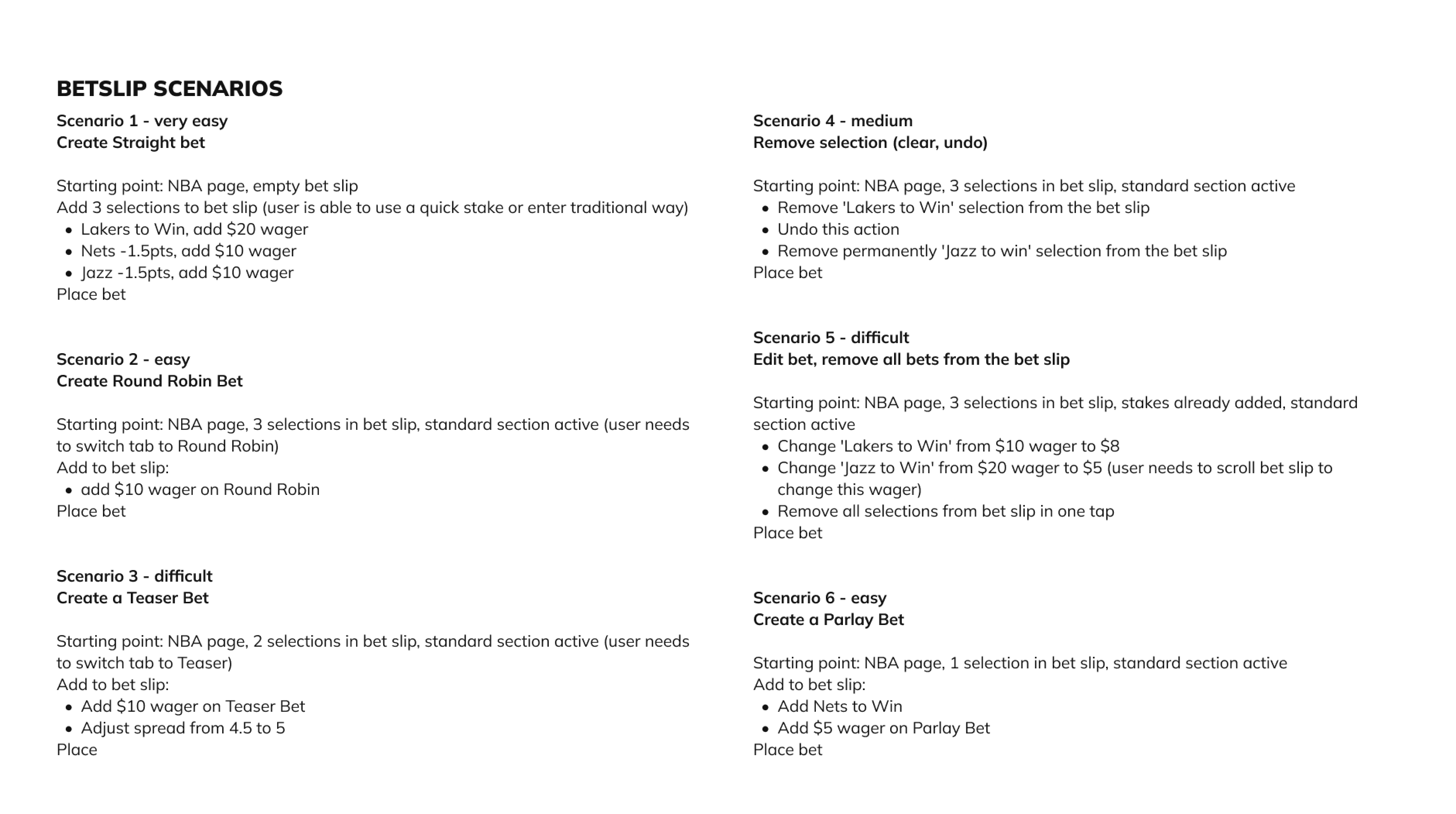
Example of betslip scenarios
Iterative design process
I followed a phased approach to ensure we were building on solid foundations and minimizing the risk of major changes later on. Here’s how the process unfolded:
I followed a phased approach to ensure we were building on solid foundations and minimizing the risk of major changes later on. Here’s how the process unfolded:
I followed a phased approach to ensure we were building on solid foundations and minimizing the risk of major changes later on. Here’s how the process unfolded:
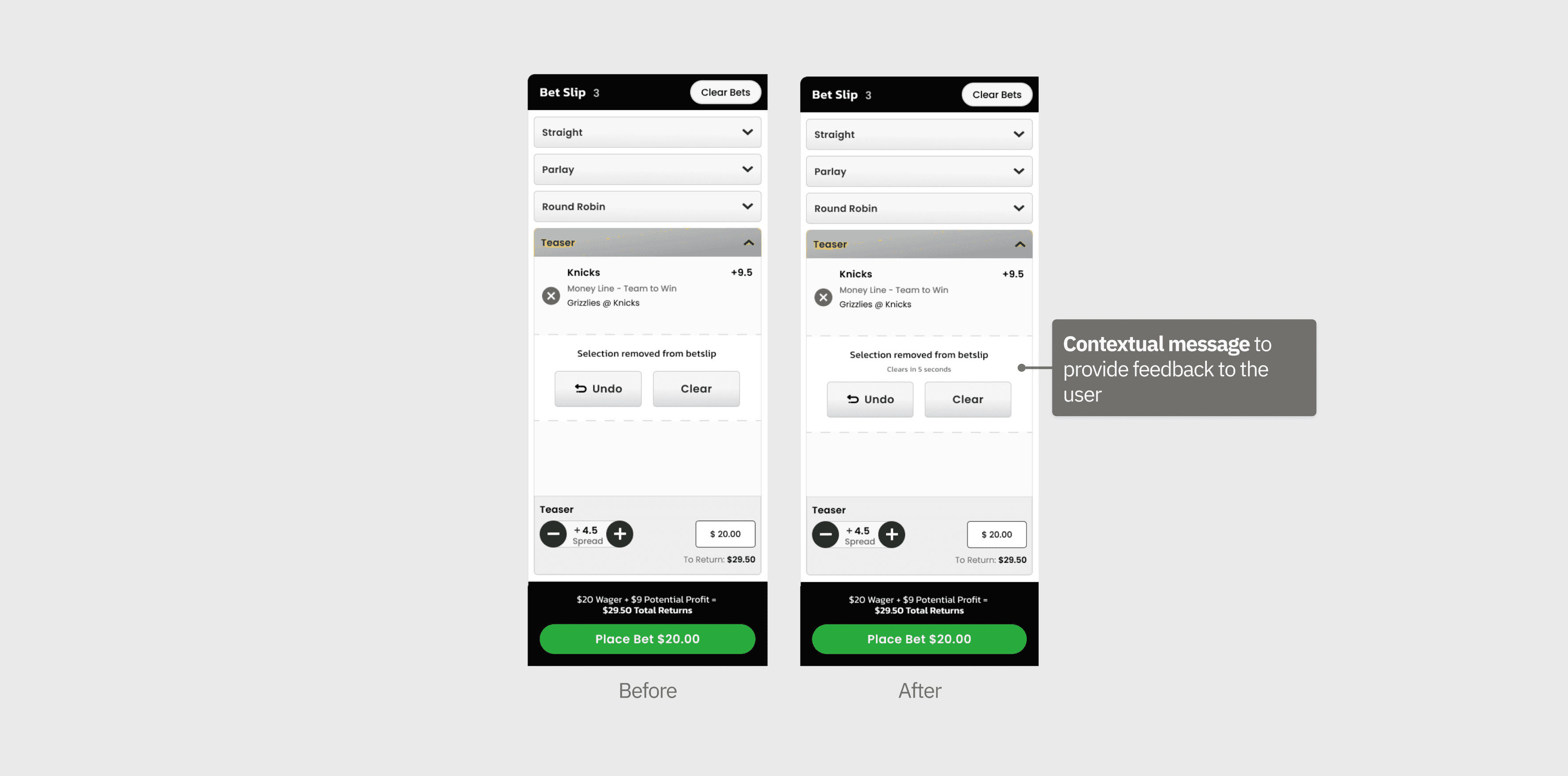
User testing & iterations
Once the wireframes were solidified, I created high-fidelity prototypes. These were tested with users to validate that the design worked as intended. We conducted several rounds of testing, focusing on flow, usability, and engagement. Key insights led to adjustments in language and UI elements to improve accessibility.
Once the wireframes were solidified, I created high-fidelity prototypes. These were tested with users to validate that the design worked as intended. We conducted several rounds of testing, focusing on flow, usability, and engagement. Key insights led to adjustments in language and UI elements to improve accessibility.
Once the wireframes were solidified, I created high-fidelity prototypes. These were tested with users to validate that the design worked as intended. We conducted several rounds of testing, focusing on flow, usability, and engagement. Key insights led to adjustments in language and UI elements to improve accessibility.
Key learnings
Designing for a global audience
Localisation is critical—what works in one market may not translate to another.
Designing for a global audience
Localisation is critical—what works in one market may not translate to another.
Designing for a global audience
Localisation is critical—what works in one market may not translate to another.
Designing for a global audience
Localisation is critical—what works in one market may not translate to another.
Designing with flexibility
Design flexibility is essential for addressing unforeseen constraints during implementation.
Designing with flexibility
Design flexibility is essential for addressing unforeseen constraints during implementation.
Designing with flexibility
Design flexibility is essential for addressing unforeseen constraints during implementation.
Designing with flexibility
Design flexibility is essential for addressing unforeseen constraints during implementation.
Validating assumptions
Always validate assumptions through user testing to uncover hidden pain points.
Validating assumptions
Always validate assumptions through user testing to uncover hidden pain points.
Validating assumptions
Always validate assumptions through user testing to uncover hidden pain points.
Validating assumptions
Always validate assumptions through user testing to uncover hidden pain points.